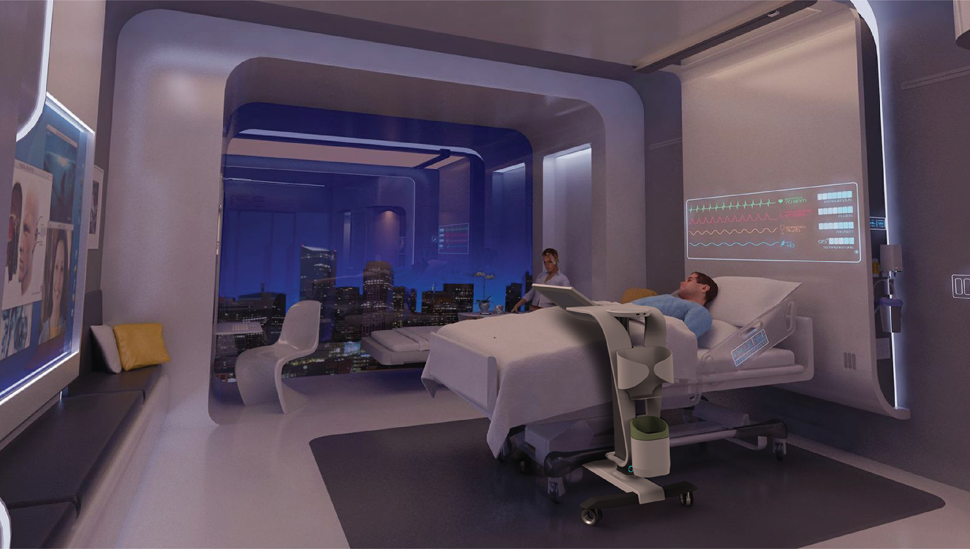
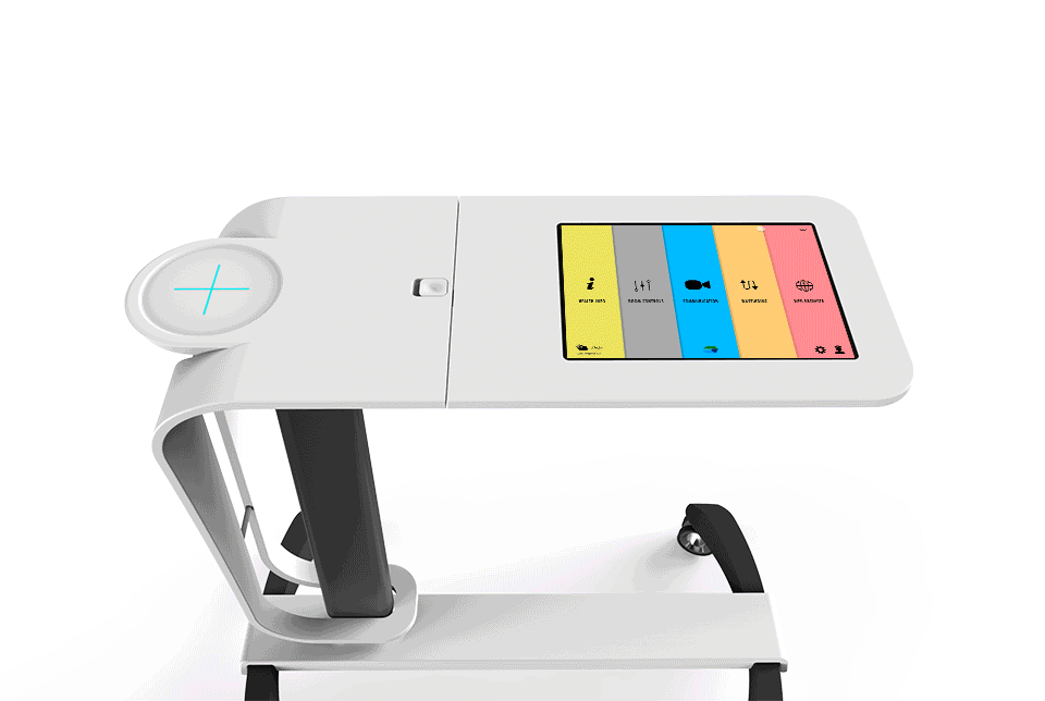
Hospital environments can be very daunting. Often, the patient feels vulnerable and without control while the staff is overwhelmed. The PC digital experience is a new platform for engagement. It empowers the patient, providing them with more control of their environment , educational tools to better manage their health and live communication with experts worldwide. The design combines two elements, an overbed table and a touchscreen table, which form a single piece of mobile furniture that can be utilized in a wide range of healthcare settings.
The Patient Companion project was initially conceived as a university research project between Clemson and Carleton Universities. Years later it became the non-for profit organization NXT Health based in NYC. My involvement focused on industrial and experience design.
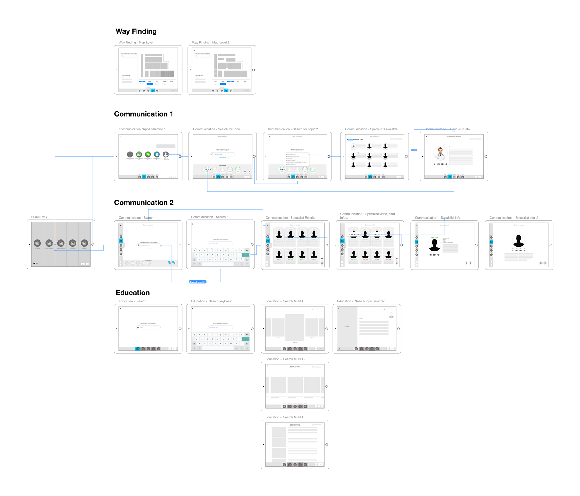
Health Info | Learning about your condition
Health info filtered and edited from the best sources, so the patient gets the most important data without searching countless and useless articles online. The user must first start a search on a specific topic related to their medical condition. The search results would be filtered to provide the simplest and most effective info.
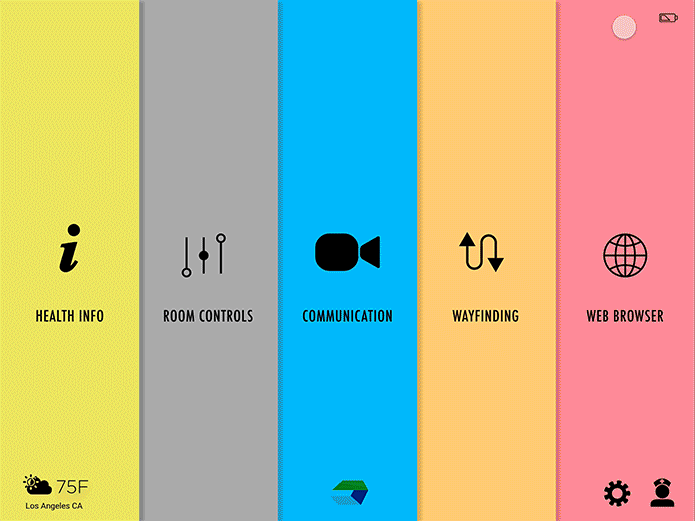
Wayfinding | Helps patient navigate environment
Patients can be autonomous and navigate their way within the hospital, putting less strain on the staff. User can click on the desired map destination and follow the instructions.
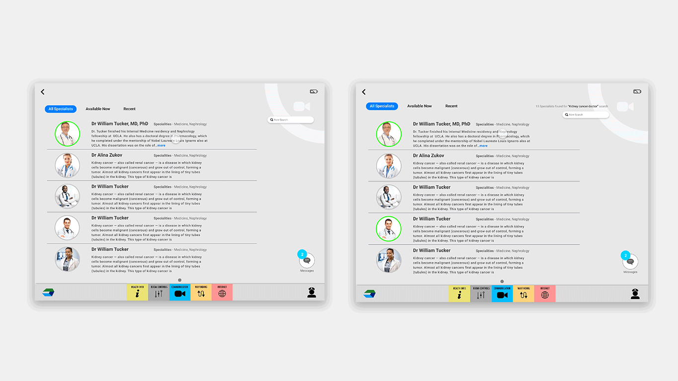
Communication | Talk with specialists live
Get real-time consultation from specialists world-wide. Doesn't hurt to have a second opinion. Users begin with a search to determine what specialist they need. They can also access their favorite communication apps to contact friends and family.
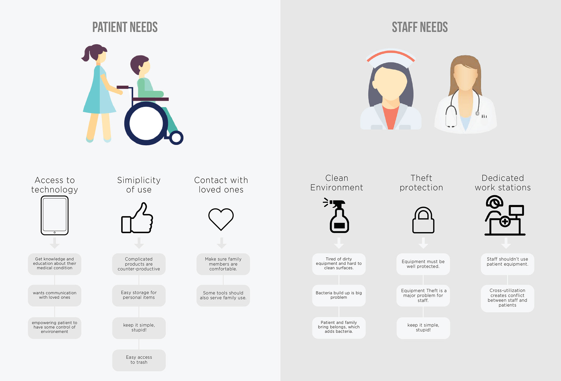
Ethnographic research and onsite contextual interviews were conducted to determine specific needs of the user and the hospital staff. The staff have first hand experience in dealing with patients and provided valuable insights.
User Research
Mind Mapping and Wireframing

Prototyping
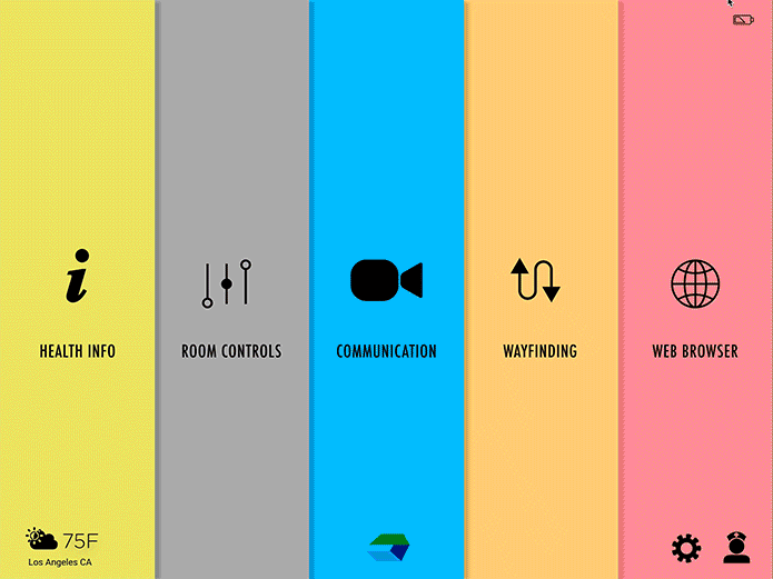
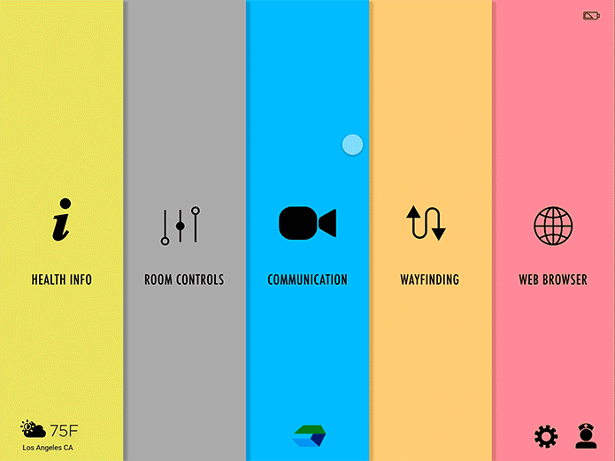
Home Page
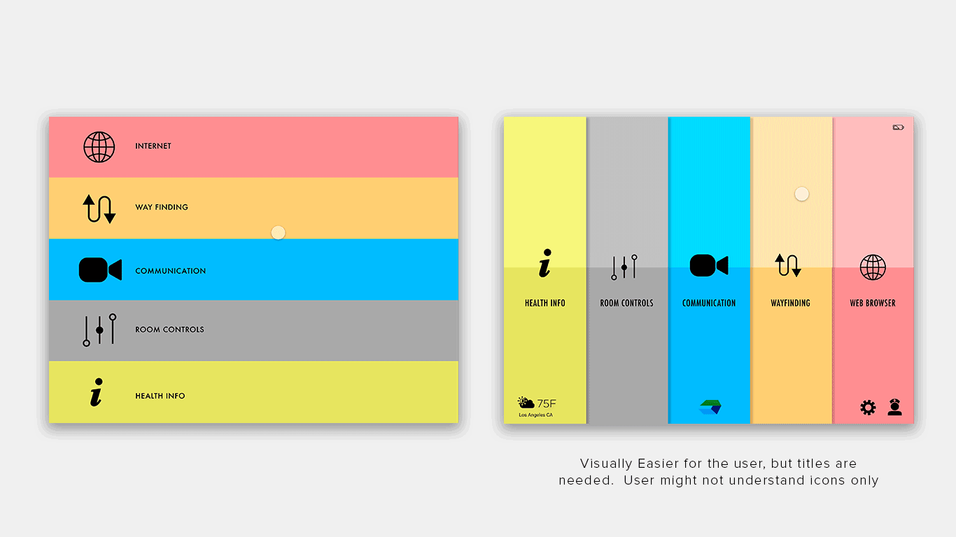
The user demographic is very broad, the home page needs to be very intuitive. Most medical software visuals tend to be bland. The use of large colour blocks was chosen to make the experience more dynamic as well as easily for the user to select.
User Testing
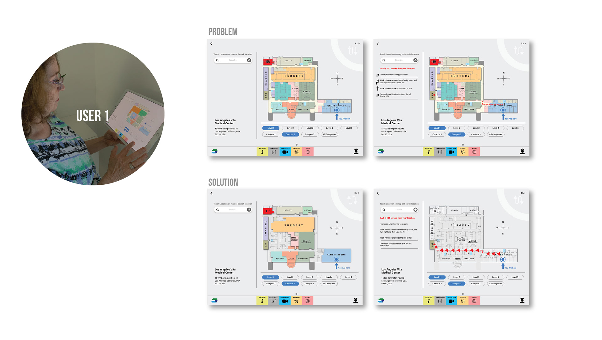
USER 1 really liked the idea of giving the patient more control over their environment.
PROBLEM | The map was visually distracting and hard to understand. It was also hard to see the directional arrows
SOLUTION | Cleaned up the map, using stronger color blocks, making it easier for the user to select.
PROBLEM | The map was visually distracting and hard to understand. It was also hard to see the directional arrows
SOLUTION | Cleaned up the map, using stronger color blocks, making it easier for the user to select.
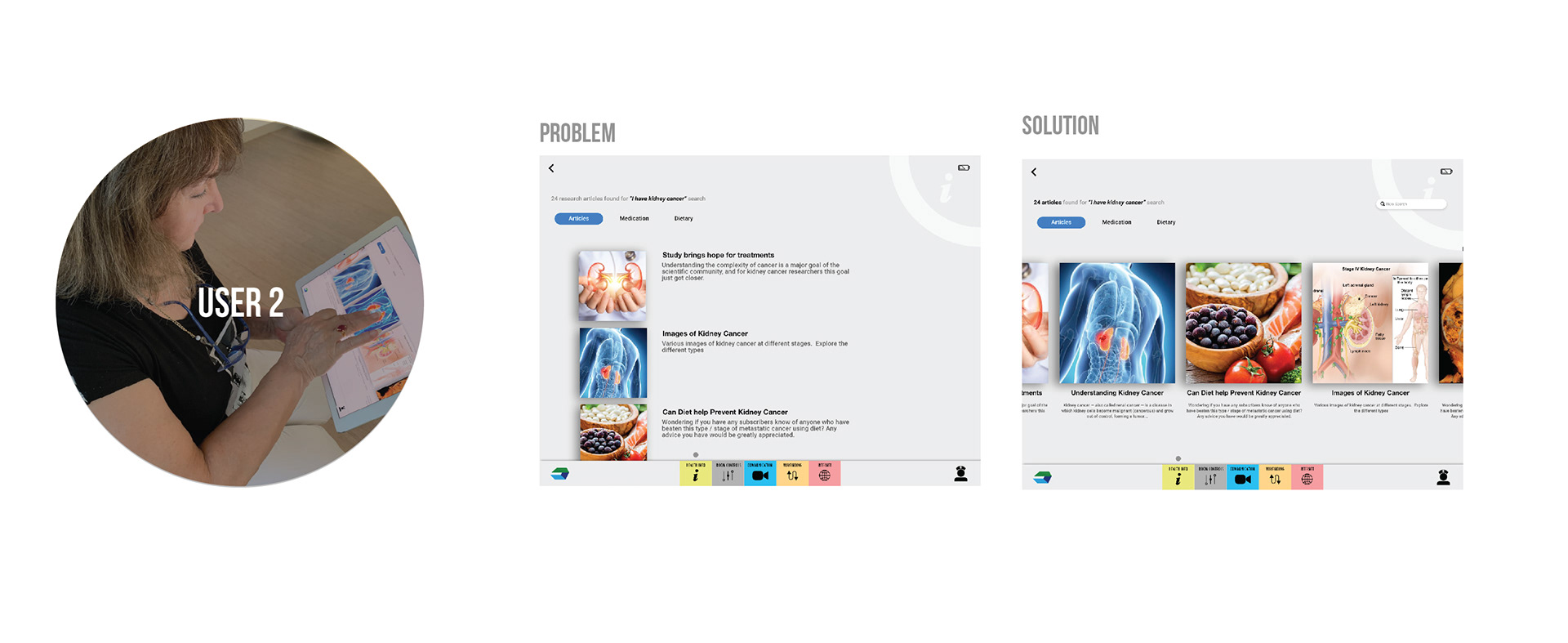
USER 2 wasn't as tech savy and had a harder time navigating through each page.
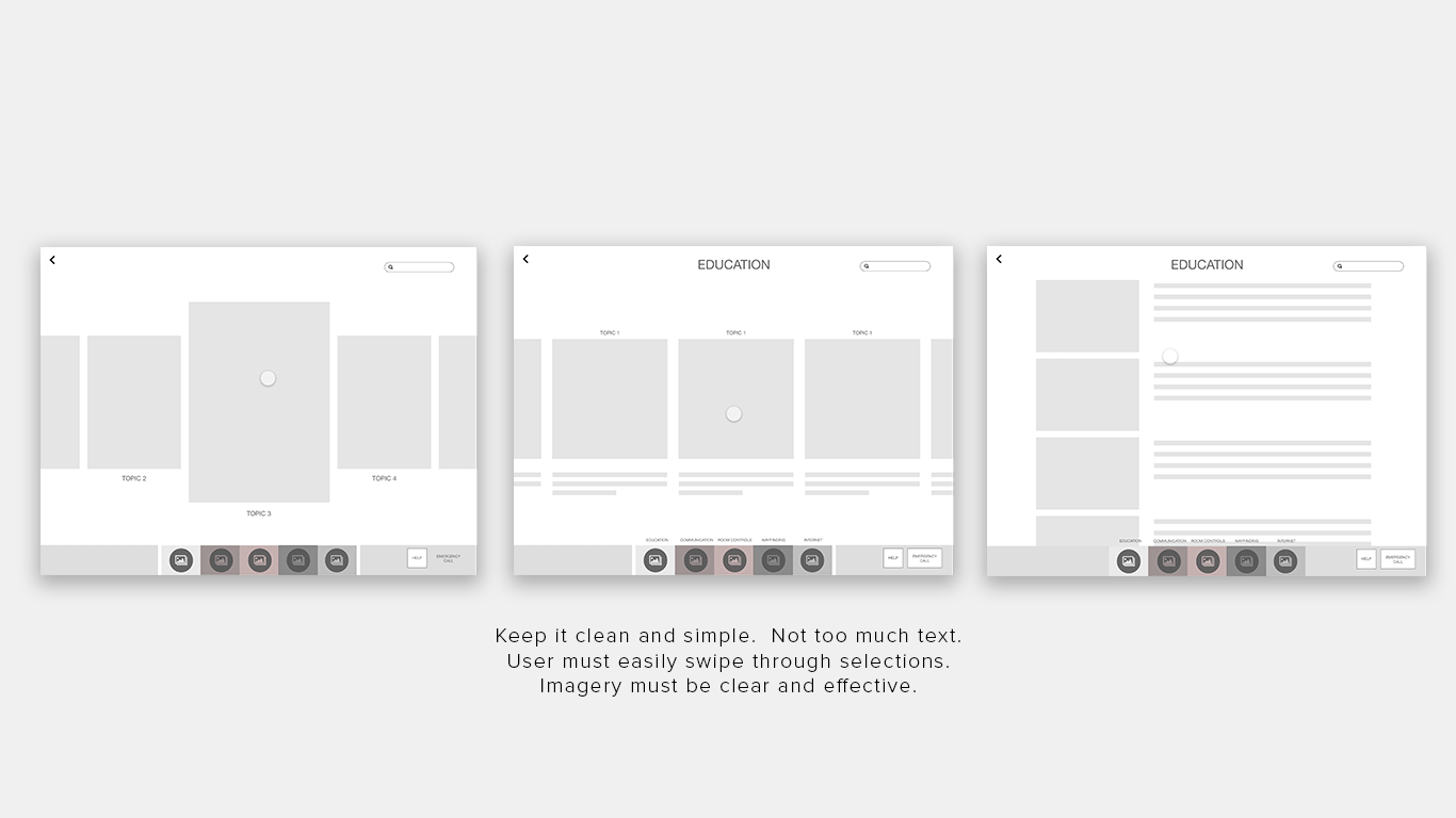
PROBLEM | Imagery was too small and the intuitive swiping selection was from side to side
SOLUTION | Increased the image size and selection orientation.
PROBLEM | Imagery was too small and the intuitive swiping selection was from side to side
SOLUTION | Increased the image size and selection orientation.
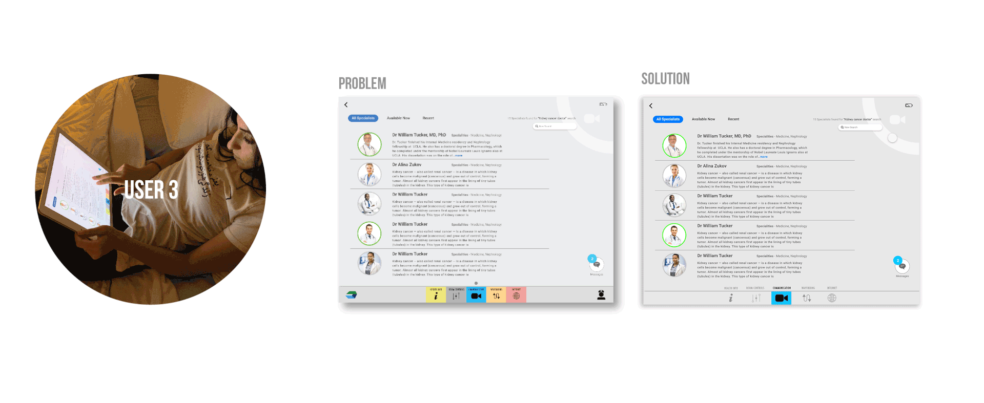
USER 3 was tech savvy and had few issues navigating from page to page
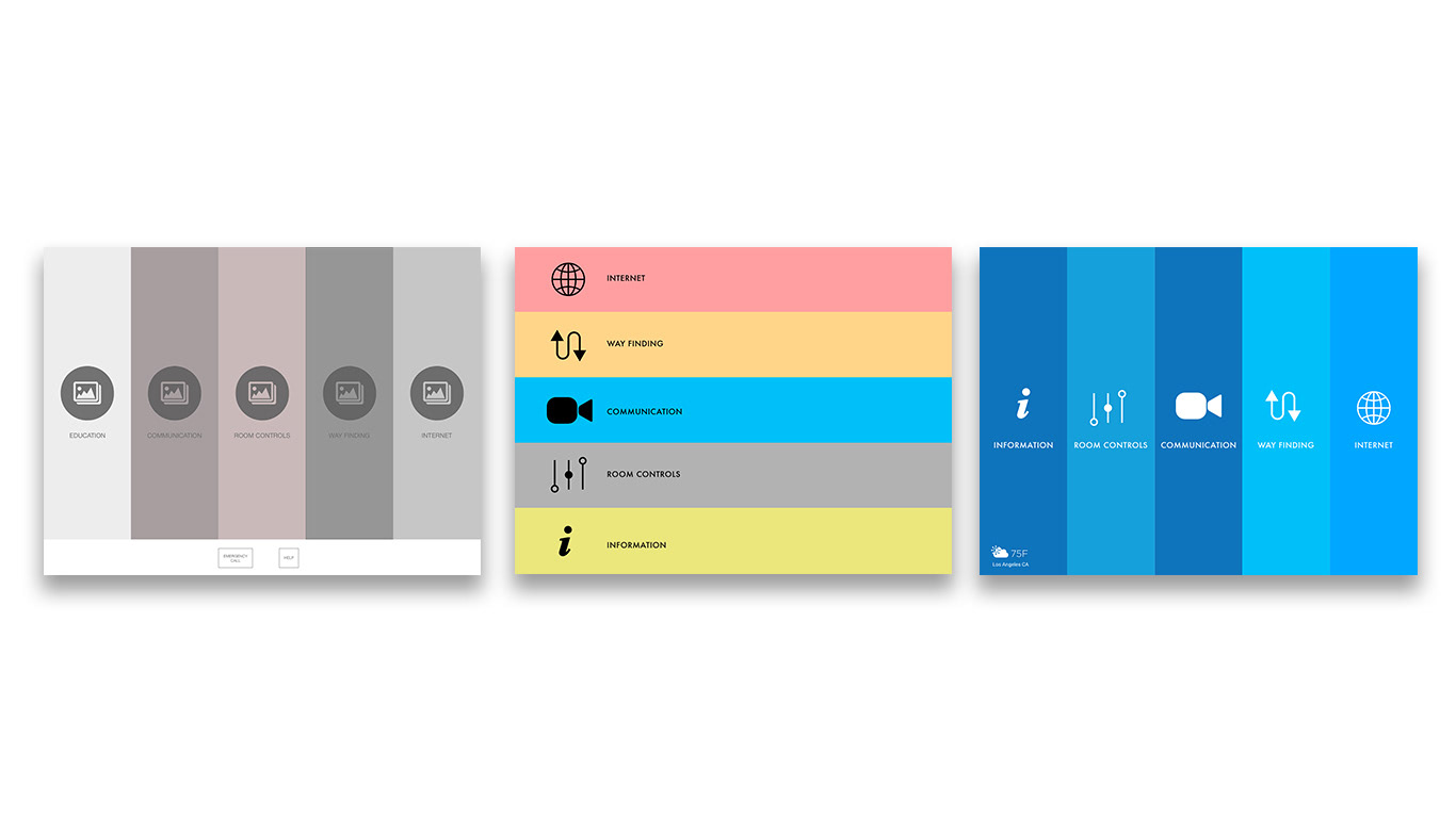
PROBLEM | Multi colored bottom menu bar was distracting and headings a little too small.
SOLUTION | Created a standby mode, where as the icons are hidden and user can click to make re-appear
PROBLEM | Multi colored bottom menu bar was distracting and headings a little too small.
SOLUTION | Created a standby mode, where as the icons are hidden and user can click to make re-appear